
Dynamic Photo Color effect
www.tutorialized.com

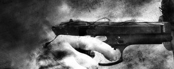
1. First, open up an image (preferably a photo but anything can do). Make sure that all layers are flattened/merged into 1 single main background layer (Layer - Flatten Image) but also take care to keep a backup of the file so that you can still edit it in case you mess up with this one.
1.5 Desaturate the image (Image - Adjustments - Desaturate) or you can do that manually by holding CONTROL + SHIFT + U.
I.E:
2. Open up the color balance box (Image - Adjustments - Color Balance) or manually by holding CONTROL + B and apply the following settings.
Color Levels First variation: Shadows: Cyan:Red -37 Magneta:Green -16 Yellow:Blue +21; Midtones: Cyan:Red -32 Magneta:Green +34 Yellow:Blue +48; Highlights: Cyan:Red +29 Magneta:Green -30 Yellow:Blue -81.
Color Levels Second variation: Shadows: Cyan:Red +70 Magneta:Green +39 Yellow:Blue -39; Midtones: Cyan:Red +56 Magneta:Green -74 Yellow:Blue -35; Highlights: Cyan:Red -20 Magneta:Green +7 Yellow:Blue -58.
First Result/Second Result: